
Logo recently designed for Madhya Pradesh Tourism by a leading, award-winning Indian ad agency.
Tyger Two:
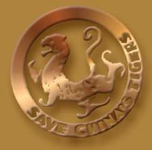
Logo of Save China's Tigers, an organisation that's been around for a few years.
Hem, hem, kof, kof.
Update: Shodan, in the comments, points us to..
Tyger Three!
The Shotokan Karate symbol.
Shodan informs us that
This logo is from the International Shotokan Karate Federation. You can also see it at Shotokan Karate of America, Shotokan Karate International India the Shotokan Karate-Do International Federation official site, and, oh, a bunch of other sites.The tiger was painted by the great Japanese artist, Hoan Kosugi, to honor Master Funakoshi (father of modern Karate) who used it on the cover of his first book.
Now we don't know about you, but personally, we wouldn't advise anyone to go borrowing logos from folks who can smash bricks with their bare hands and all that.
Update 2: We did a bit of digging. Here's a much better version of the Shotokan symbol. And this page tells us that Gichin Funakoshi's Ryukyu Kempo: Karate (the book Shodan pointed us to) was published in 1922 in Japanese. And here and here you'll find a little more history.
11 comments:
I have "copied" it on my blog:
http://newnimproved.blogspot.com/2006/09/mp-tourism-versus-save-chinas-tigers.html
Thanks!
They're similar, but it's possible there's nothing more to the connection. Given how many logos are made by designers every day, the chances of a repeat are pretty high. Lots of emblems are round, for a start. Lots of them have text anchored to the curve of the circle. Lots of them have a visual within. There are many ways you could depict a tiger. You could put in the face, but that would be too Shiv Sena-ish. You could put in a pug mark, but that's just juvenile and random. You could put in the entire tiger, like it has been here. If you look at royal emblems, you often find the tiger's legs bent the way they are here. As for the curl of the tail, I'd say it's a design call because just look: on the other side of the 'y' of 'Madhya', there's a twirl the other way. It balances.
You know this scourge of our past life, Peter. The horrible sound of a boss saying, "I've seen something like this elsewhere," no matter if the idea came to us in a drug-induced hallucination.
"Did he smile his work to see?
Did he who Adobe'd remake thee?
Actually the tiger is lot closer to Shotokan Karate's symbol. They have been using it for years. See for yourself.
http://www.ska.org/
The tiger was painted by the great Japanese artist, Hoan Kosugi, to honor Master Funakoshi (father of modern Karate) who used it on the cover of his first book.
What, they didn't consider the "tiger tearing the head off a mustachioed hunter while his (tribal) wife screams for help and performs a snake dance to please the Tiger King" logo?
SKA was just a quick handy link. The tiger is used world over by every "Shotoakn" affiliate.
Shodan,
Thanks. Changed text accordingly.
Not mentioning these friends would be churlish on my part.
http://www.jkaindia.org/_Final/NkkdHome.htm
The Madhya pradesh logo looks more like the 1922 book, So it seems that bothe the MP logo and the Tiger logo are copied from it, though the tiger logo has been slightly modified.
It is not surprising that this has happened. What do you expect? Originality? You expect too much. Plagiarism is something that happens in films, songs, books.. so why not logos.
ranon,
Yeah, it happens. But one is an incurable romantic. Whattodo?
Dont let the detractors pull you down
My thanks for posting the Shotokan Logos
MyShotokan.com
Post a Comment